Creating and viewing reports in the Yandex Advertising Network
Create a report
To create a report, go to Statistics from the left menu in the Yandex Advertising Network interface and select YAN. Saved reports appear in My reports.
You can also open reports for a specific app or ad unit from the page listing apps or ad units. Find the one you need and click Statistics.
Step 1. Choose a report template or create a custom report
Select a report template from the list that appears when you choose YAN. If you can't find a perfect template, select the most relevant one. You can add more parameters later.
You can also create a report manually. Go to Statistics, then click to open the menu. Select YAN → Create new report.
Note
To create a Yandex Mediation report, start by changing the report type. Hover over the Statistics tab in the left menu and select Mobile Mediation instead of YAN. Report templates and statistical metrics for mediation analysis will appear.
Step 2. Select a time zone and currency
By default, the time zone matches the one set in your Yandex ID, and all financial metrics are shown in rubles. To change the time zone or currency, click ![]() and select the option you need.
and select the option you need.
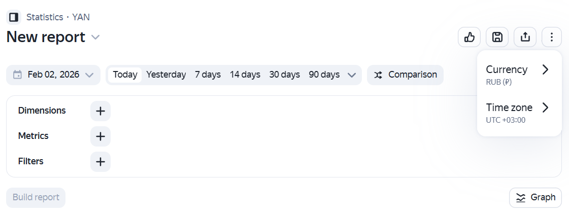
After you select a time zone and currency, confirm your choice in the modal window. Click Change to save your settings.
The selected time zone and currency will appear in the Report Builder. They'll be used by default for all new reports, but won't affect the reports you've already saved.
When you create a new report, the time zone and currency are automatically set to the most recent values:
- From the most recently viewed report.
- From the selections you made in the Report Builder.
Note
If you receive revenue in dollars or euros, the revenue amount in the report may differ from the amount paid. This is because revenue is calculated in rubles and converted into another currency at different rates:
- For statistics: At the rate of the Central Bank of the Russian Federation on the day of the impression.
- For payment: At the rate of the Central Bank of the Russian Federation on the last day of the reporting period.
Example of calculating revenue in dollars
Let's assume the partner receives revenue in dollars. In September, they had the following impression count:
- September 9 — for 200 rubles
- September 16 — for 240 rubles
- September 23 — for 260 rubles
- September 30 — for 280 rubles
How monthly revenue is calculated in reports
|
Impression date |
Income in rubles |
Rate of the Central Bank of the Russian Federation on the impression date |
Revenue in dollars (in the report) |
|
September 9 |
200 |
50 rubles/$ |
$4 |
|
September 16 |
240 |
60 rubles/$ |
$4 |
|
September 23 |
260 |
65 rubles/$ |
$4 |
|
September 30 |
280 |
70 rubles/$ |
$4 |
|
Total for the month |
980 |
— |
$16 |
How the payment is calculated
To pay revenue, the partner's total monthly income (980 rubles) is converted to dollars at the exchange rate of the Central Bank of Russia on the last day of the reporting period (September 30):
980 rubles / 70 rubles per $1 = $14
The difference between the revenue amount in the report and the amount paid is $2.
Step 3. Specify the report dates
Select the report timeframe from the list at the top of the screen or specify the desired dates in the calendar.

To compare reports from two different timeframes:
-
Specify the dates of the first timeframe in the calendar.
-
Enable the Comparison option next to the calendar. Another period appears.
-
Choose the start date for the second period in the second calendar. The end date is set automatically, or you can select one from the suggested options.
- Previous equal period
- Last month
- Last year
For an accurate comparison, the calendar ensures that the periods have the same number of days.
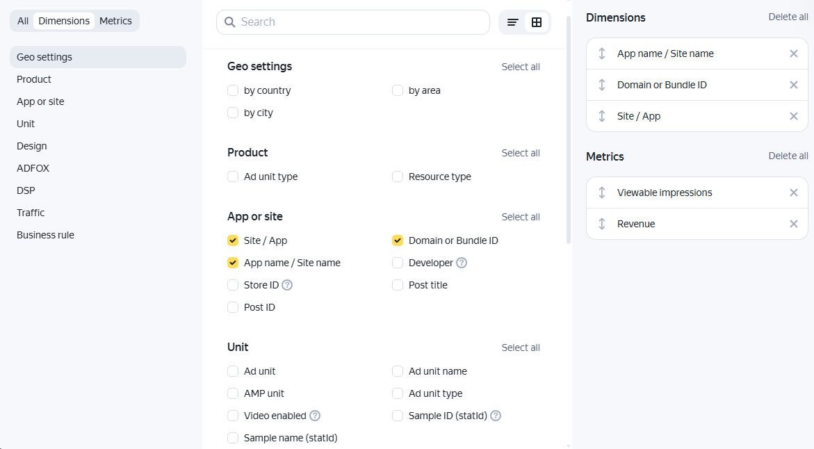
Step 4. Configure dimensions, metrics, and filters
If you're using a template to create your report, the main parameters will be set automatically. You can always add new parameters or remove parameters that are already in place.
If you're creating a report from scratch, you will need to set all the parameters manually. To configure the parameters, expand the panel if it's collapsed.
Note
Among other information, the reports display data for resources where you have the Partner's assistant role. For this reason, the revenue amount shown in the reports may exceed the value displayed in the “My Revenue” widget.
If you want to only include in the report the revenue for the resources where you are the owner, use filtering or a dimension.
Determine the parameters that the report data is grouped by.
To add a dimension parameter, click ![]() in the dimensions section and select the values you need from the list.
in the dimensions section and select the values you need from the list.
The parameters you choose will appear on the right side of the modal window. When a report is generated, dimensions are applied in the order they're listed in the settings. Reorder dimensions by dragging and dropping their names directly in the modal window or on the panel. You can remove any elements you don't need by clicking ![]() .
.
Statistical metrics that you want to check for the selected data range.
To add a metric, click ![]() in the metrics section and select the values you need from the list. Check the metric's meaning by hovering over
in the metrics section and select the values you need from the list. Check the metric's meaning by hovering over ![]() next to the metric name.
next to the metric name.
The metrics you choose will appear on the right side of the modal window. When a report is generated, dimensions are applied in the order they're listed in the settings. Reorder dimensions by dragging and dropping their names directly in the modal window or on the panel. You can remove any elements you don't need by clicking ![]() .
.
Filters define the data that your report will be based on. You can filter data by a specific app, ad unit, platform, name, whether particular values are included or excluded, and other parameters.
To add a filter:
- Click
 Filters.
 - The filter bar will appear. To open the list of available filters, click
 .
. - Select the parameter you want to use to filter your report data. In the window that opens, you can search for a parameter or choose from the relevant group.
- Specify a value for the selected parameter: choose from the drop-down list or enter it manually.
Data limit on the chart
When choosing parameters, please keep in mind that the chart in your report may be incomplete if there is too much data. This restriction is applied to avoid issues when rendering charts.
For reports with a lot of data, all the rows in the table are sorted by the selected metrics in descending order and only the first 500 rows are taken into account when rendering the report chart. Moreover, the chart includes only those dimensions whose data for the selected period has made it into the first 500 rows. If a dimension's data is excluded from the first 500 rows, the dimension won't be shown in the chart at all.
If you wish to display all of the report's data on the chart, you can limit the amount of data listed in the report via filters, shorten the report period, or reduce the number of dimensions in the report. You don't need to limit the number of metrics used in the report, because they don't affect the number of rows displayed in the table.
Report limit example
Let's say a partner has 5 apps, with 5 ad units each — that's 25 ad units in total.
If you generate a 30-day report for all 25 ad units, grouped by day and cross section ID, the report table will include 750 rows.
Rendering all of this information on a line chart would require drawing 25 lines for each selected metric. However, if the 30-day report is limited to 500 rows, the complete charts will only be available for the first 16 cross section ID values. The remaining 9 values will not be included in the chart.
Report setup example
Let's say you need to find out your expected revenue from serving ads in ad units for a week. To create this report:
-
Filter the data so that only ad units are displayed. To do this, click
Filters, switch to Product, and select Ad unit type. Select In-app ad units from the list. -
Choose dimension parameters for your metrics.
For example, to see which apps generate the most revenue, you can group data by domain, ID, and app name. Add the following dimensions: Domain or Bundle ID, Site / App, App name / Site name.
-
Select the following metrics: Viewable impressions and Revenue.
-
Group the data by day. This way you can track the change in revenue and the number of impressions during the selected week.
What the report settings fields look like
Step 5. Click Create report.
A chart and a data table will then appear at the bottom of the page.
Viewing a report
The report is available as a chart and a table.
Note
Expand the left menu to view all reports, or collapse it to make more space for your table or chart.
You can display a line chart or a bar chart. To choose a chart type, use the drop-down menu above the chart on the right.
Configure the chart's level of detail using the drop-down list next to the metrics. You can group data by day, week, or a custom period.
The horizontal axis displays the following information:
- For line charts: dimensions by period.
- For bar charts: dimensions by category.
To remove a dimension from the chart, disable it in the dimension list on the right.
The metric values are on the vertical axis. When you create a chart, all metrics are shown by default. You can enable or disable the metric display from the list above the chart.
If you wish to view the exact value of a metric, hover your cursor over the corresponding row or column. A field with the name and value of the desired metric will then be displayed.
If needed, you can toggle the chart by clicking ![]() Graph on the right side of the report settings panel.
Graph on the right side of the report settings panel.
You can choose the table type:
- Simplified data table.
- Hierarchical table with grouped data.
Hierarchical tables display structured data, with low-level items nested inside higher-level items. Click ![]() to switch from a simplified table to a hierarchical table.
to switch from a simplified table to a hierarchical table.
You can sort table data by any column — just click the column name. The data will be sorted, and an arrow icon (↑ or ↓) will appear next to the column header, showing the sort direction. You can sort the following data:
- Parameters with a numeric value may be sorted in descending or ascending order.
- Parameters with a text value may be sorted alphabetically.
To reorder columns, change the order of metrics or dimensions in the report settings.
More report actions
Use the options next to the report name to:
Add report parameters:
- : Name the report and save it to My reports in the side menu;
 : Copy the report link and share it with others (only authorized Yandex Advertising Network users can view the report).
Rename the report:
 → Rename: Set custom names for your reports, even those generated from standard templates.
Add the report to your dashboard:
- → Send to dashboard: Add the report or chart to your dashboard for quick access.
Save a report
To save the report in XLSX format, click ![]() . You'll find this option on the right side of the data area.
. You'll find this option on the right side of the data area.